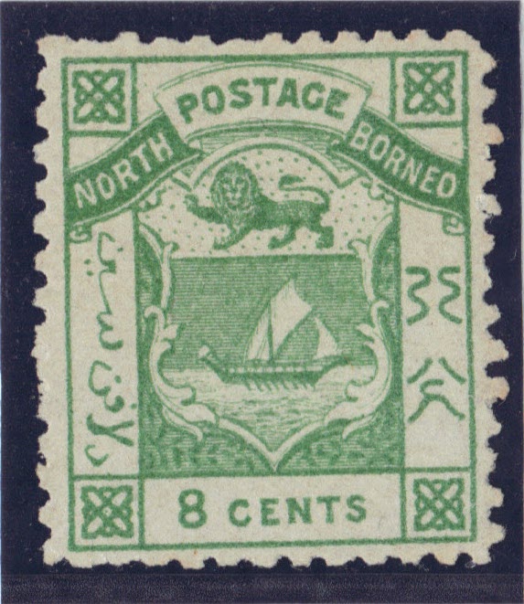

The very first NB stamps were engraved by Thomas Macdonald and printed by Blades, East and Blades Ltd. The 1883 8c is shown rather than the very first stamp, the 2c brown. They both have the same design. The 8c stamp has a better colour.
The high values follow a similar format over the years showing variations bearing the arms of the company. They were also printed and designed by the same company. The motto "Pergo et Perago" in Latin can be interpreted as "I proceed and I accomplish" but has been translated with a slight difference elsewhere. A good motto to follow where collecting stamps is concerned!


The use of two colours in these 1894 stamps by the Waterlow and Sons was certainly the one big step in making NB stamps highly attractive. These were probably among the very first stamps to make use of contrasting colours in a pictorial format.
They were recess printed leading to a much higher level of detail showing designs which would have been considered to be highly exotic at the time. Anyway, the aim was to increase sales and generate income.
Somehow, in comparison to earlier issues, they have left out the native and Chinese scrip. The 8c stamp shows a large native prahu with Mt Kinabalu in the background. These native ships were invariably manned by pirates prior to colonisation.

The Waterloo's records indicate the engravers on these set of nine stamps were James Bain, Joseph Rapkin and his son who was also called Joseph Rapkin. The design for the above stamp was revolutionary because in order to accomondate the full majestic length of the beast, the frame on the left side was broken to make way for the tip of the tail. This also happened with the 5c Great Argus pheasant stamp.

The Mount Kinabalu scene is also exceptional in its detail. It was copied from a drawing by Frank Marryat aboard the HMS Samarang which surveyed the coast of Borneo in 1843 rather than 1841 as stated in part 2 of the NB handbook. He was the son of the famous author Captain Marryat. I remember reading his most famous novel "The children of the New Forest" while at primary school.
The view was possibly from Ambong Bay which he visited. He only surveyed a small part of North Borneo and spending most of his stay in Sarawak, many a time in the company of Rajah James Brooke. As far as I can tell, he did not visited Maruda Bay in the north or any of the enclaves on the east coast of North Borneo.


The 1911 high values are all well designed stamps. They are my overall favourites and it is hard for me to choose between the $5 and $10 stamps in terms of colour scheme. The $5 shown here is an unlisted variation in shade being a lot brighter and much nearer to the 1929 issue in colour.


The two shown here are perf 12 and therefore from the 1925 issue rather than 1909. They showed the same designs even though there are slight differences in shade of colour. The animals were well depicted in these series but not without controversy. The two shown here were not indigenous to North Borneo. It is difficult to know what went on to allow these designs. I suppose the main aim was to sell more stamps by making them attractive regardless of accuracy, thus generating more profit for the company that ruled North Borneo.
The 12c stamp shows the Palm Parrot and the 24c shows the Cassowary which are indigenous to Australia and New Guinea respectively.
A few interesting observations here include the printing plate getting rather worn on the 12c stamp. The lines are lacking near the R of revenue and above L of London at bottom right. The other inconsistencies in this set includes the lack of a stop after British Protectorate in the 18c/20c stamp and no stop after Postage and Revenue in the 2c, 3c, 4c, 5c, 12c, and 18c stamps. There is also an unessential gap in postage & revenue in the 24c stamp as seen above. A lack of consistency pointed to some haste in preparing the original 1909 issue.


For many, the 1931 issue is the best in terms of design and pictorial content. Almost certainly they were very well executed and has none of the flaws and perforation varieties of earlier issues.
After much reflection, I have decided that the Murut would be my favourite here. Examining it carefully, one could palpably feel the dignity and charisma of the person depicted within a very well designed frame. It was certainly exotic to the extreme. Others would have chosen the 25c Clouded Leopard or the $5 stamps with fair justification.
This comment has been removed by the author.
ReplyDelete